On this page
Product Design
The Design Process for Early Stage Startups
Why your scrappy prototype is the best brief a designer can get, and why you shouldn't stay on it a day longer than necessary.
Most founders I work with at early stages have the same instinct when they first get on a call with me: apologize for what they've built.
They've been heads-down in Lovable or Bubble or Cursor for months, assembling something functional but rough. It works and conveys their vision, but it doesn't look or feel like a real product. So before they share their screen, they say some version of the same thing: "I don't want to show you what I've made because I'm worried it'll bias you."
I tell them the opposite is true. Show me everything.
The instinct that the messy prototype is a liability is one of the most common misconceptions I run into at this stage. Even though visual design is better than ever with these types of tools, many founders still don't love what they've produced once they're ready to ship it. But for a designer like me, the problem isn't the prototype. The problem is staying on it too long.
Your prototype tells me more than you think
When I watch cooking competition shows, I'm always struck by how quickly an experienced chef can read a dish. An aspiring cook presents something nervous and imperfect — maybe the execution was off, maybe the flavors are muddled — and the chef immediately understands what they were going for. Not from a verbal description. From the plate itself. They can see the instincts, the ambition, the gap between intention and result. That's far more useful than anything a description could communicate.
That's exactly how I feel about prototypes.
In 2014, founders would show up with Balsamiq wireframes — grey boxes and placeholder text that communicated the rough logic of a product. It was helpful, but it required a lot of translation. Today, founders show up with something that actually moves, responds, and holds data. The thinking is more exposed and the fidelity is higher. I can see what they believe the core workflow is, which features they prioritized, what patterns they were influenced by, and where the product logic breaks down.
Seeing that picture upfront makes me a better designer. I'm not working from a description of an idea — I'm responding to an artifact of one. The prototype is your brief.
"Cleaning it up" usually costs more than starting right
Here's where the advice gets harder to hear.
Founders who've spent weeks or months in a prototyping tool often want to preserve as much of that investment as possible. So they ask for a cleanup: make this look better, fix the inconsistencies, polish the rough edges. I understand the impulse. But in most cases, I push back.
In late 2024, I worked with Reportwell, a reporting tool for charter schools. They came to me with a Bubble app they'd been building for a while. It worked but they needed to move it off Bubble to an owned platform they had more control over. They were short on time and resources so the plan was to simply move it over 1:1. But this is never really possible. It's a fallacy that when re-platforming—whether it's a website or product—to believe no changes will be made. With that in mind, I did my best to transition without adding work.
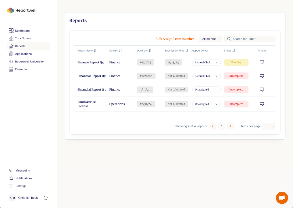
The previous screen was live in Bubble. It wasn't bad — but it lacked personality and polish. Given the constraints, my initial "redesign" on the new platform amounted mostly to better use of color and typography:
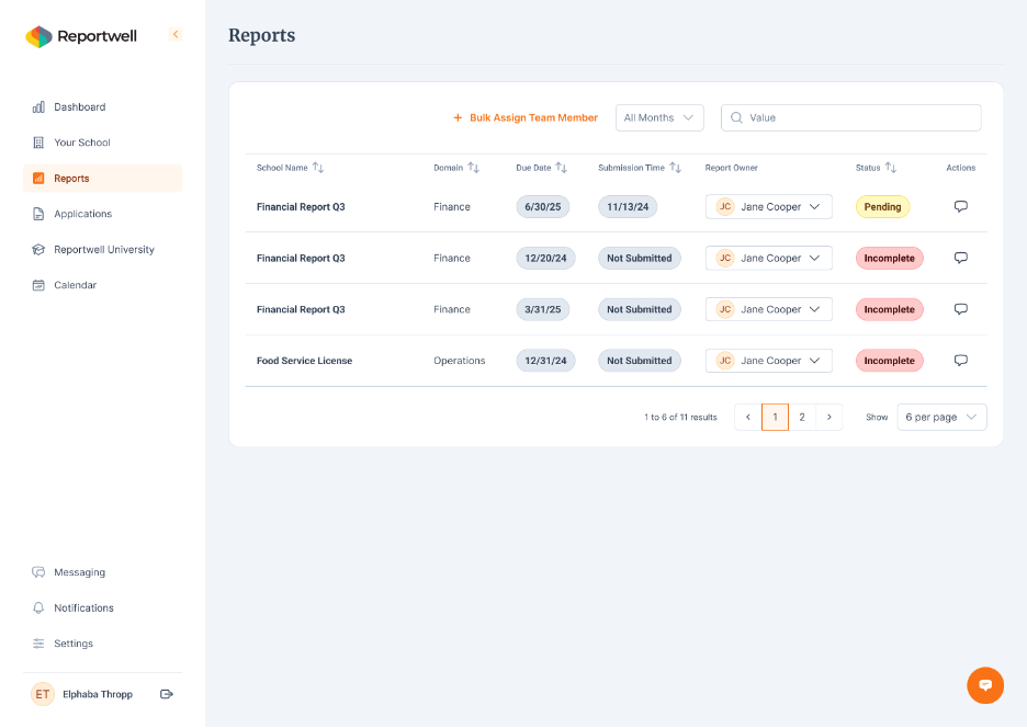
About a month into this process, the possibilities of what could be done opened up immensely and we embarked on a fuller redesign:
The result was significantly better than anything the cleanup path would have produced. Sure, it took a month of time and money, but revamping the "prototype-first" design at this stage created massive value going forward and avoided mounting product debt.
Design systems and code frameworks are finally speaking the same language
The single biggest change in early stage product design over the last few years isn't AI, it's the convergence of design systems and engineering frameworks (which is enabled with AI).
When I'm working with a founder who's ready to graduate from their prototype, the first conversation I have with their lead engineer is about what framework they're most comfortable with. Most teams building on React have a preference such as MUI, Shadcn, and similar component libraries. Once I know that, I build the design directly on top of that system.
This matters more than it sounds. It means that when I hand off designs to engineering, there's no translation layer. Components I've designed map directly to components they already know how to build. The handoff that used to take weeks of back-and-forth takes days.
I worked with a contract analytics startup recently — a one-person engineering team moving fast. Their developer had a strong Shadcn preference so I built the entire design system on top of that, customized with the brand guide we'd developed for them two months earlier. When I handed off the designs, he was able to implement in a single evening. The shipped product was polished, cohesive with their brand, and built on a stack their future team could maintain without needing to be re-educated on custom tooling.
That's what modern early stage design looks like when it goes right.
The five-step process
With all of that context, here's how I approach product design for early-stage startups today:
1. Define a rough PRD from the prototype I don't ask founders to write documentation before we start. I use what they've built as the PRD — walking through the prototype together to align on what stays, what changes, and what gets cut. The prototype makes this conversation faster and more concrete than any spec document.
2. Build a simple product navigation Before designing any screens, I map the navigation. This is where most AI-built prototypes have their biggest gaps — they have screens but not a coherent product architecture. Getting this right first saves significant rework later.
3. Align with engineering on framework The conversation with the lead engineer or CTO about framework happens before I open Figma. Design built around their stack moves faster and sticks better.
4. Customize the design system to the brand Starting from an established framework like MUI or Shadcn, I apply the product's brand — colors, typography, spacing, component variants. This is where the product stops looking like every other AI-built app and starts looking like something with a point of view.
5. Design key screens and user flows With navigation, framework, and design system in place, the actual screen design moves quickly. The constraints are defined. The components exist. The work is about judgment and prioritization — which flows matter most, where the product needs to delight, where good enough is genuinely good enough.
The design process for early stage startups hasn't changed in its fundamentals: understand the product, define the architecture, build with the team, ship something coherent. What's changed is the quality of what founders bring to that first conversation, and how quickly a well-structured process can take them somewhere worth shipping.